
Technologies
Figma
Webflow
Adobe Lightroom
Adobe Photoshop
Notion API
Chat GPT4
Crystal Vision Website Design
Jun 2023
Project Type
Web Design
Industry
Art
Position
Volunteer
About the Brand
Crystal Vision is visual artist Crystal Apodaca’s brand. Crystal is a talented body painter, illustrator, and multi-media artist.
About the Project
Crystal Vision web design showcases Crystal’s unique visual art style and previous projects, including body painting, illustration, and generative AI artworks. The site includes image galleries, details on each project, about, contact, and upcoming live events.
Objective
To design and build an online portfolio that showcased Crystal’s artworks, driving demand for future project requests, collaborations, and commissions.
Role
Aside from Crystal’s actual artworks, I produced all materials.
Responsibilities included:
- Project management.
- Information organization.
- UI Design & mockup creation.
- Light Prototyping.
- Webflow development.
Challenges & Considerations
- Creating and conveying a brand true to Crystal’s artwork.
- Defining a site structure that allowed for her unique creativity to shine.
- Displaying portfolio pieces.
- Creating a website that’s easily editable in the future.
Strategy & Process
Gathering Content
To begin, Crystal gathered all recent examples of her artwork into a shared Google Drive folder. This included photographs of her recent body paintings, illustrations, and generative AI artwork. I downloaded all the examples and uploaded them to an fresh Adobe Lightroom Catalogue. In Lightroom, we chose the top artworks in each category, and applied color correction to the photos so that they would be aesthetically pleasing as a whole. We compressed and exported the photos for quick loading on the web.
Creating the brand
I asked Crystal to create a list of brand adjectives that she would like to resemble her brand. After a few brainstorming sessions, we solidified the list in the style guide sheet below. Together with ample samples of imagery, I was able to pick a serif font she loved (serif for maturity) and begin developing a color palette focused on simplicity, balance (shades of gray) and creativity (purple). Lastly we added subtle iridescent hues of pink, purple, and blue to the brand, to add a sense of cosmic wonder and harajuku-inspired element.

Determining the site structure
Next we needed a general site structure to frame the website’s content. You can think of the structure as an artistic portfolio / shop structure hybrid, expressed in the “Shop” and “Recent Artworks” columns below. The main intention was to give Crystal everything she would need to establish a profitable online presence.
We used a Notion database for project management and content creation. Content was created with the help of GPT4, then organized in Notion.

Homepage Design
Brand and content structure combine to create the UI design below. Colors, typography, and imagery are consistent throughout. The home page structure is logical, in the section order of hero, about, multiple scrollable/clickable artworks organized by type, upcoming events, a contact CTA, and footer.

Components are easily repeatable and harmonic in style. For instance, if another “Recent Works” type is added (for instance, video creation), it could be easily added below “AI Generation”.
About Page Design
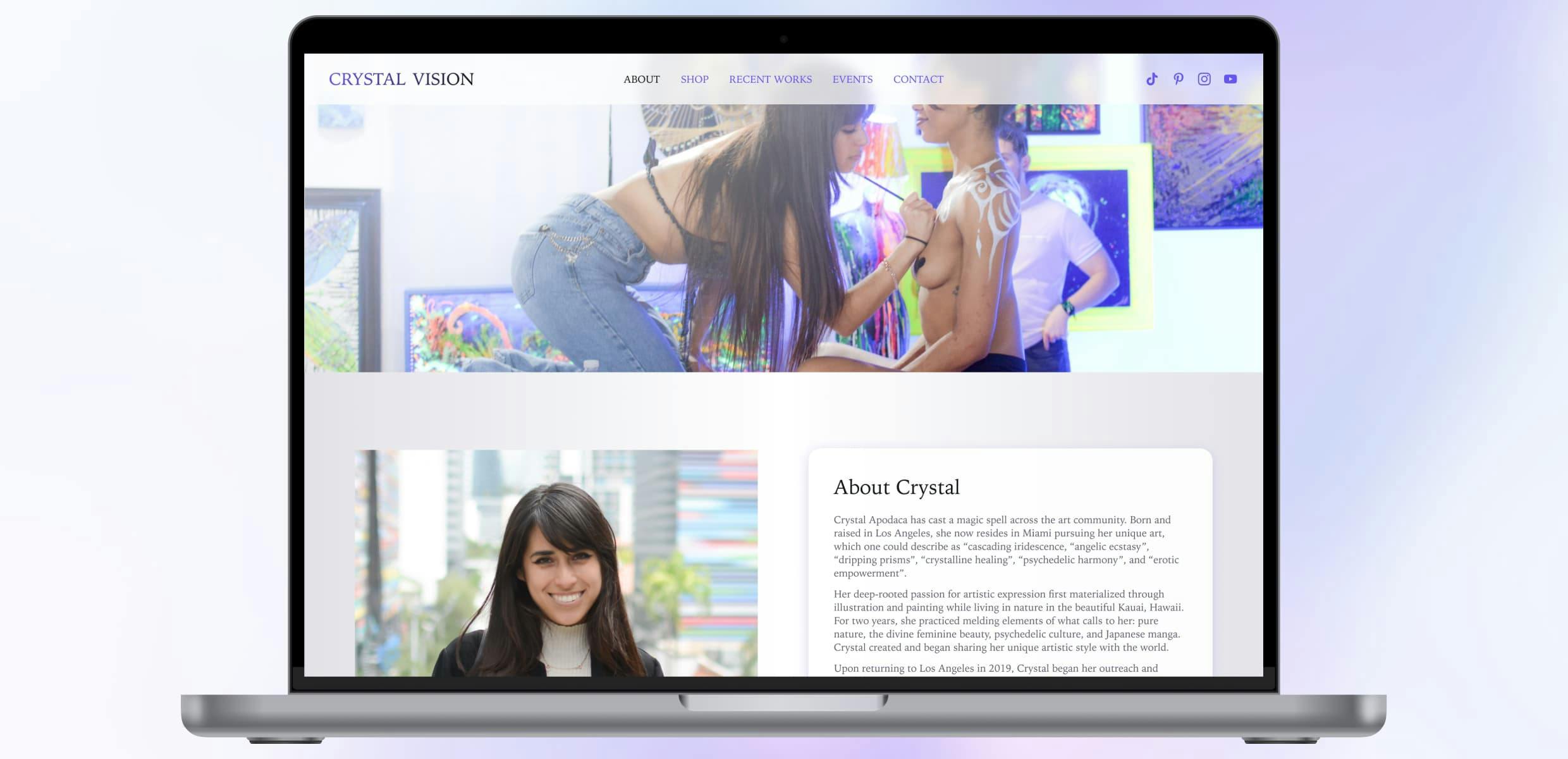
The about page explains who Crystal is, gives a bit of her relevant history, and encourages viewers to contact. Visually, it’s another extension of the Crystal Vision brand, with similar styles, components, and imagery as the home page. Imagery and biography compliment each other to give an overall idea of who Crystal is and what she does.
Header imagery (as well as multiple profile pictures) are all chosen for their harmonious integrations into the brad. You’ll notice that almost everything has a hint of purple (the primary brand color), and lays easy on the eyes when together. The page has a slight metallic silver gradient through the background, which acts as an atmospheric backdrop cleanly tying the content together.
I wrote the biography based on everything I know about Crystal, and also took most of the pictures with my Nikon D7100 + 35mm prime lens.

Contact Page Design
For the contact page, we went with a simple form for a name, email, phone number, and message. All bookings, inquiries, and general messages would come through this form, powered by Webflow. Fields are dark to draw attention to where the viewer should interact with the page. Half of the page is an image of my favorite of Crystal’s artworks, chosen for its quality and intricacy to suggest a professional tone for inquiries.

Several other page designs are complete and available upon request.
Results & Impact
To date (August 2023), the Webflow development of this site is not complete. However, Crystal has expressed approval and excitement towards the brand and site designs. We will continue once my schedule frees up.
Reflection
What Went Well
- Created a flexible but powerful brand true to Crystal’s artwork.
- Defined a logical site structure and created accurate and descriptive content.
- Permeated the brand through components and imagery throughout the site.
- Finding an scalable, non-limiting web platform that would allow Crystal to update content on her own (Webflow)
What Was Challenging
- Time management for the project, as there were many brand/content reworks.
- Determining what parts of the design/build process to focus on and at what time.
- Wearing several hats at the same time - project manager, content creator, designer, and page builder.
What I Learned
Working with artists is very challenging, as being so visually creative tends to come with a general lack of structure in thought processes. But when you provide high quality structure to their creative expression, the results are often amazing. You have to be careful while doing this though, as your job as a designer is to let their work shine, and not get in the way.
What I'd Do Differently
Write more of the content (or asked Crystal to write more of the content) up front. This wasn’t a deal-breaker, but it would have led to a more efficient design and build process.