
Technologies
Figma
Midjourney
DreamBox.AI Marketplace Design
Jun 2023
Project Type
Web Design
Industry
A.I.
eCommerce
Position
Freelance
About the Brand
DreamBox is an online platform where users create/submit generative AI art/designs, then sell those designs as physical products. Examples include plushies, 3d figurines, prints, jewelry, apparel, and digital assets.
About the Project
The DreamBox Marketplace is a custom eCommerce webapp (currently in development) where customers browse generative AI art/designs from DreamBox creators, then submit orders for physical products using the designs. Essentially Etsy for generative AI.
Objective
To deliver high-quality, complete, responsive (mobile, tablet, desktop) Figma web designs in for the upcoming DreamBox Marketplace.
Role
Cofounder/designer Ivan Surguroff designed the Dreambox.AI brand, website, and AI creation UI. However, due to the platform’s rapid success and growing cofounder responsibilities, Ivan decided to outsource the design role for new features and products.
My role was scoped solely on the Marketplace: an Etsy-inspired marketplace for generative AI.
Responsibilities included:
- Light UX research and proposition
- Wire-framing
- UI Design & mockup creation
- Light Prototyping
Challenges & Considerations
- Design an easy-to-understand, clean layout structured for large quantities of products that wouldn’t overwhelm the customer.
- Fluid designs on mobile, tablet, and desktop.
- Logical structure with suggested product categories.
- Interactive reviews, favorites, shipping, and social elements.
- Identification, application, and development of existing brand (colors, fonts, components, etc).
- Design in Figma using Auto Layout for all components
Strategy & Process
Research for this project was quick and efficient, scoped to DreamBox’s existing offerings and the Etsy’s current live version. Specifically links to browsing and single product templates:
- https://www.etsy.com/search?q=figurine&ref=search_bar
- https://www.etsy.com/listing/1222012219/dragon-statue-dragon-figurine-mythology
Brand Style Guide
Before beginning the Marketplace UI design, I took the time to first identify brand styles, fonts, colors, and existing components from Ivan’s previous designs. I created a quick brand style guide sheet in Figma to reference as I designed the Marketplace.

Afterwards I began designing mockups for the Marketplace Home and Single Item Pages.
Marketplace Home Page Design
The Marketplace Home Page is designed to focus attention on products (primarily) and storefronts (secondarily). The UI grids sit in the background as the image content remains in focus. Inside ProductCard components, product images are intentionally the largest visuals on the screen, to focus the user’s attention and entice them to click through to a product page. Each ProductCard component contains a “quick add to cart” button in the top right corner for impulse buyers.
Searchbar, filters, arrival times, recently viewed queue, and sorting options are all available and logically placed to quickly guide customers to relevant products.
“Good design is as little design as possible”, is a quote by legendary industrial designer Dieter Rams that strongly believe. While not perfect, that ideology shines through these UI designs.

Marketplace Single Item Page Design
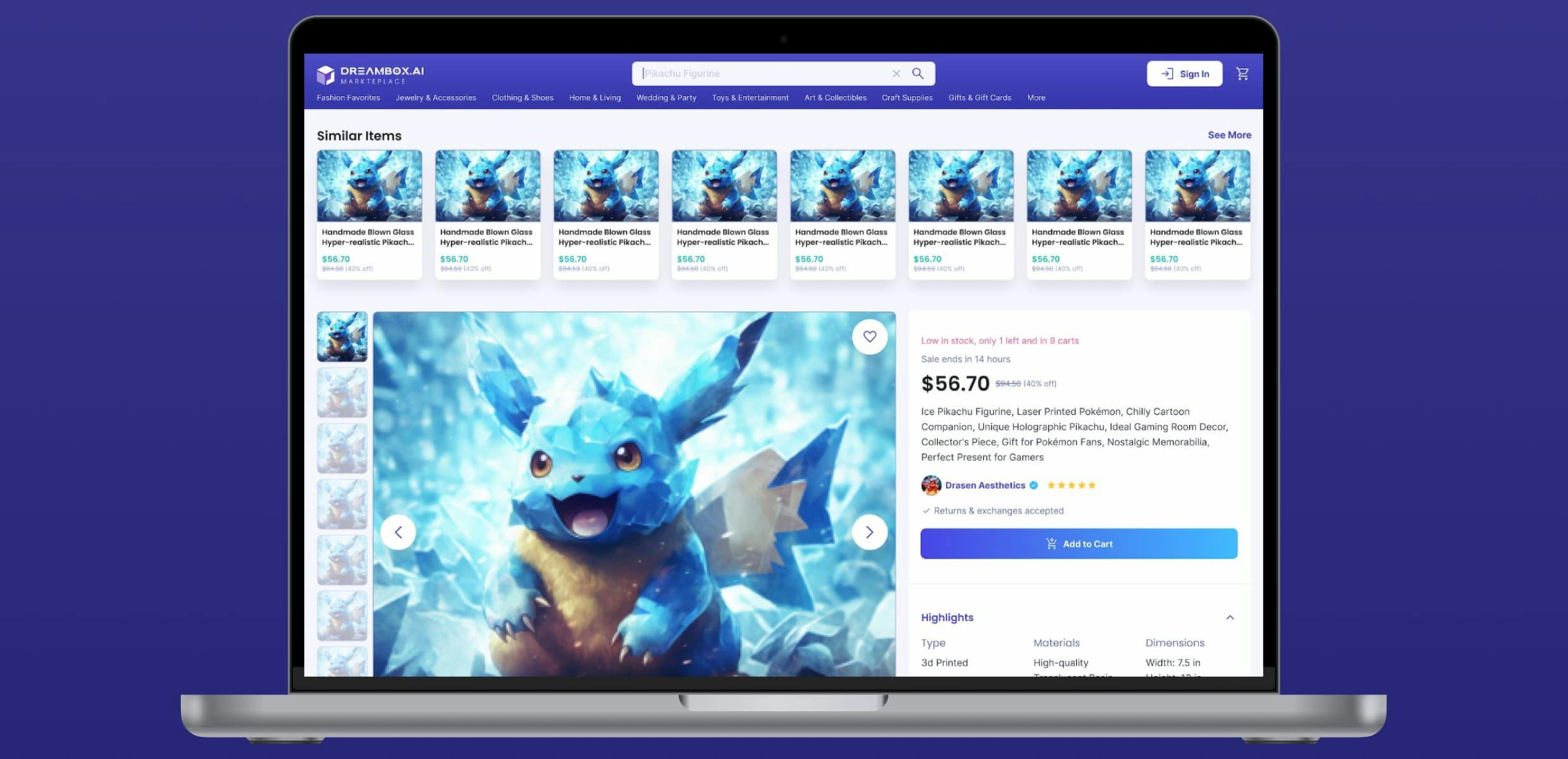
The Marketplace Single Item Page design focus on a single product. All features are aimed to provide relevant, accurate information that would go in to a purchase decision.
- Multiple images of the product, presented in tiles and carousel format
- Description, including shipping, processing, specification, packaging, notes
- Seller information (trust)
- Shop and product reviews (social proof)
- Price, discount options, time limit (urgency)
For those just browsing, the following queues are provided on the tops and bottoms of the page: similar items, more items from this shop, and related shops.

Results & Impact
The client was very pleased with the finished designs. They judged the designs to be on-brand and to have achieved the project objective: an Etsy-style generative AI marketplace. Upon delivery, they immediately shared the designs with their developers to begin building the marketplace. Very smooth process. I look forward to working with them again someday.
Reflection
What Went Well
- Open communication of expectations and timeframes.
- Prep-work and research required.
- Focused on the core essence of the design.
What Was Challenging
I spent a lot of time trying to incorporate video reels into the marketplace home design. This ate up a lot of time, and didn’t end up in the final designs. It reiterated an important concept in design: start simple. I could have saved a lot of time by starting simple.
What I Learned
This was my first project designing around AI generative art. I learned a lot about how AI businesses are built, the thought processes behind combining old and new technology, and how to integrate an industry-standard design concept (like an eCommerce storefront) with an exponential technology (Generative AI). I learned a lot about Midjourney, decentralized production, auto layout in Figma, and building an online community around a shared interest.
What I'd Do Differently
- Keep it simple.
- Ask for more feedback throughout the process.