
Technologies
Figma
Adobe Illustrator
Wordpress.org
WooCommerce
PHP
Sass
JavaScript
jQuery
Namonai Brand, eCommerce Web Design, Frontend Development
Dec 2020 - Apr 2021
Project Type
Web Design
Frontend Engineering
Industry
Art
eCommerce
Position
Co-Founder
About the Brand
Namonai was a Japanese fine art eCommerce and portfolio creation platform based in Tokyo. The company helped undiscovered Japanese artists manage and sell their artwork globally. The name 'Namonai' means 'Not even a name' in Japanese.
About the Project
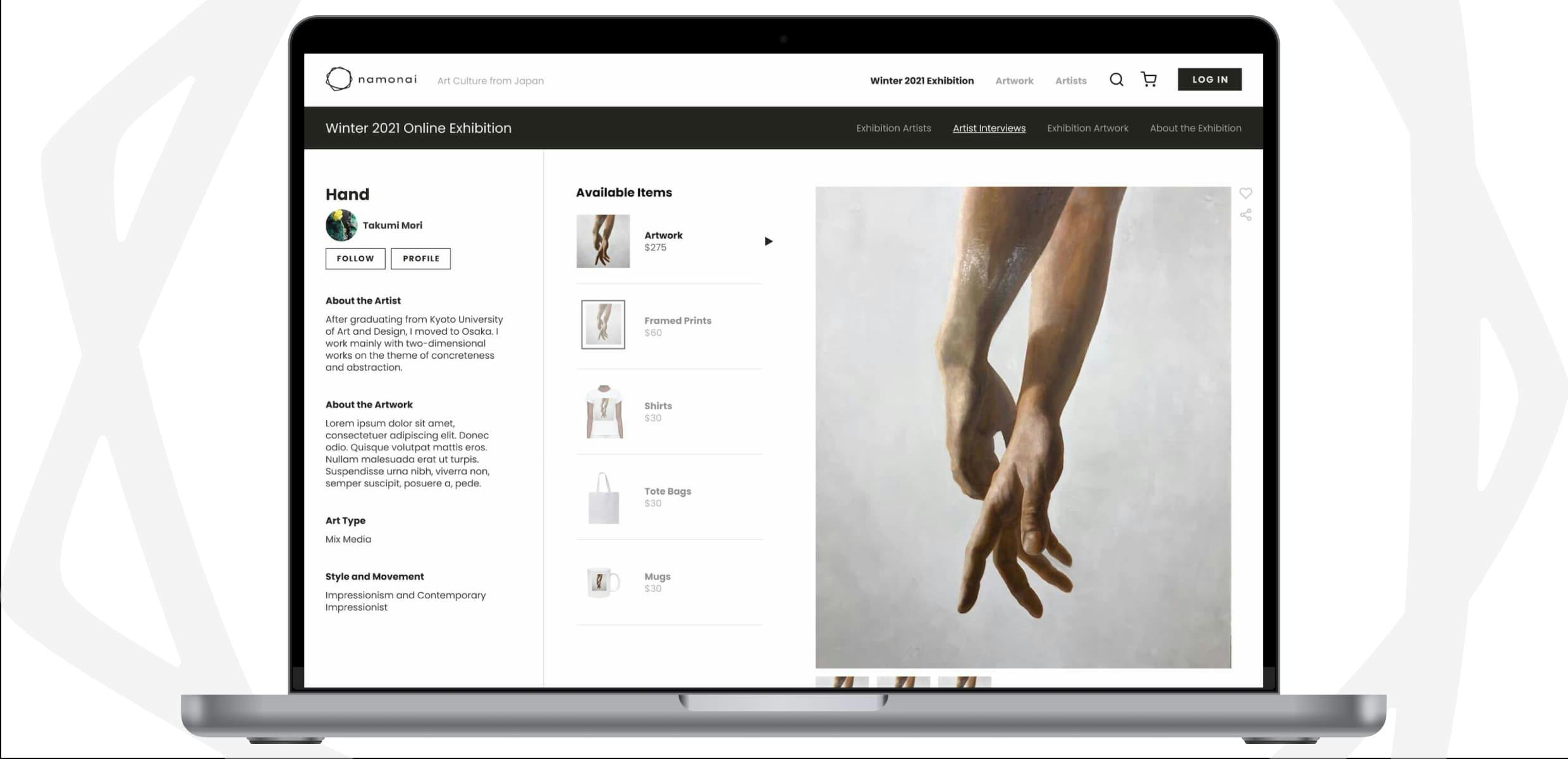
The Namonai website was a custom PHP template built on Wordpress and WooCommerce. Notable sections included dynamic artist portfolio pages, artwork pages with checkout options for printing on multiple surfaces, an online exhibition with artist interviews, and a custom checkout flow.
Objective
To create an eCommerce / art exhibition website for Namonai, a Japanese fine art eCommerce and portfolio creation platform based in Tokyo. We had collected 20+ Japanese fine artists interested in the project, and needed to create an English-based website where he could showcase their artworks for sale to the world.
This website would:
- Display portfolios for each Japanese artist.
- List each artists’ Japanese artworks.
- Allow visitors to order the original artworks or prints of each artwork on hoodies, tote bags, mugs, etc (like Redbubble).
- Remember artists and visitors in a robust login system.
And, of course, it needed a professional brand with complimentary marketing materials for Instagram, Pinterest, etc.
Role
In the beginning, three of us worked on this project as cofounders. Akira focused on business strategy, Alex King focused on full-stack engineering, and I focused on web design and frontend engineering.
Challenges & Considerations
- Accurately express Japanese fine art to a global (Western) audience through brand and design without losing its essence.
- Design and create a technological system that allowed visitors to order prints on apparel (like Redbubble).
- Organize all artists portfolios in a logical, easy to browse, and visually interesting way.
- Design and implement a robust search system.
- Design and implement an ordering system where a visitor would order a Japanese artwork, trigger a drop shipping order, and send that final product overseas to their address.
Strategy & Process
Brand
The Namonai brand is designed to be simple, pure, calm, and balanced. Colors are mostly grayscale, leaning towards lighter hues. Doing this allows the artists’ work to remain the focus on each page.

Website Structure
The Namonai website was large. At a high level, it included browsing and accounts pages. Dynamic templates included artists’ portfolios, artworks, and artwork collections.
Both artists and collectors could log into Namonai, and depending on their user type, would see different options in their submenus. Collectors could favorite artworks, follow artists, and purchase artworks and paraphernalia. Artists could do all the same, as well as upload artworks and create their own portfolio.

Design - Artist Portfolio Page
The artist portfolio page is designed to be simple and comprehensive. We wanted to give our artists a way to share their works without needing to have their own website. The portfolio page include a hero image, profile image, name, about, socials, artworks, collections, history, awards, and exhibitions.
This design was based on actual research - we asked Namonai artists what they would want on a portfolio page.

Design - Artwork Page
Naturally, Namonai sold Japanese artists’ original artworks (paintings, ceramics, etc). But it also sold prints, shirts, tote bags, and mugs with said artworks on them (like Redbubble). Artwork pages included add-to-cart options for all of these items.

Design - Winter 2021 Online Exhibition
In Winter 2021, Namonai held an online exhibition, introducing Japanese artists to the rest of the world. Our ambassador team of five people found nine Japanese fine artists, catalogued their artworks, and recorded video interviews for the online exhibition.
Below are some page designs showcasing snippets of the video interviews, the artists, and their artworks.

Design - Artist Interviews
Artist interviews were the crux of the online exhibition. Collectors could learn more about the artist, and have the chance to resonate with the way they saw the world. Each artist interview page contained their interview video, artworks they’d created, their overview, and a link to their profile for more.

Design - Order Confirmation
Namonai branding permeated throughout the entire website, including the checkout process. From first view until checkout and beyond, no detail was left unconsidered.

Design - Email
We created multiple custom emails for communicating with both artists and collectors. All emails adhered to Namonai brand, colors, typography, and were written in both Japanese and English.

Results & Impact
Alex and I worked on developing Namonai part time (in addition to our full time jobs) for over a year. The project can be considered “complete” when we had launched the Winter 2021 Online Exhibition, as all major function of the site were live.
After launch, we sold around 5 - 10 products over the span of a few months. Likely this was due to lack of marketing effort and no investment to push the business forward. The idea and implementation were objectively good enough, but unfortunately I don’t think we had the skillset or experience to make Namonai succeed. Alex (full-stack developer) and I also had full time obligations that we needed to focus on post-launch. We ended up taking down the Namonai website in early 2023.
Reflection
What Went Well
- Namonai was an interesting idea and I enjoyed creating it with my great friends Akira and Alex.
- The brand, UX, and UI design all turned out well.
- We successfully created a working system that did everything we set out to do.
What Was Challenging
- This project suffered from scope creep. It took a long time before we landed on the final value proposition. The initial goal was simply to showcase artworks from artists we managed, but that became building a robust portfolio system, allowing printing on physical items, and an online exhibition.
- The problem that we were trying to solve as a business wasn’t very important.
- Managing expectations of 20+ fine artists when nothing is being sold and they are in contract with other Japanese galleries.
What I Learned
- I learned how to create login systems and online stores (WooCommerce) in Wordpress.org.
- I went through the entire design process for online stores, portfolio creation tools, and online exhibitions.
- I learned that just because you build something doesn’t mean that people will care.
- This was my first legitimate project that cofounded, so I learned a lot about the legalities of creating a business.
What I'd Do Differently
- Define scope and set hard deadlines way early from the beginning.
- Set checks in the product release process, using empirical data to figure out earlier if the value proposition was good or not, and whether or not the project should continue.
- Hire a person to take charge of marketing from the beginning.