
Technologies
Figma
Adobe Lightroom
Punta Brava Virtual Club NFT Mint Website Design
Sep 2022
Project Type
Web Design
Industry
Web3
Position
Freelance
About the Brand
Punta Brava is a luxury private golf and surf club located on the Pacific coast of the Baja Peninsula in Mexico. It's particularly known for its golf course, which is designed by legendary golfer Tiger Woods. By extension, Punta Brava Virtual Club is a member-led web3 virtual club representing the brand’s philanthropic arm. The virtual club focuses on philanthropy through securing donations for Punta Brava Medical (a Christian humanitarian organization) and Beyond the Brotherhood (a Navy SEALs post-active duty transition assistance program).
About the Project
The PBVC NFT mint website is a minting portal for the 1,800 available Punta Brava Virtual Club NFTs. The NFTs come with membership benefits, including access to exclusive IRL events, opportunities to interact with US Navy Seals, and member-only merchandise. The website details the program, benefits, and the club’s philanthropic efforts.
Objective
To design an NFT minting page for Punta Brava Virtual Club that:
- Matched the established Punta Brava Golf & Surf Club brand.
- Felt professional and prestigious.
- Focused on the brand’s charitable aspects.
- Had variations for both light mode and dark mode.
Role
- Project management.
- Information organization.
- UI Design & mockup creation.
Challenges & Considerations
- Fully understanding the Punta Brava Golf & Surf Club, then extending the brand to envision the Virtual Club NFT minting portal design.
- Designing an NFT minting page that felt professional and honest, in stark contrast to most NFT project (which are total scams).
- Extending the color palette to include styles for dark mode that felt true to the brand.
- Determining the content structure.
- Applying web2 design strategy to a web3 offering.
Strategy & Process
Brand Style Guide
Punta Brava Golf & Surf Club is a professional, established brand. When extending that brand to Punta Brava Virtual Club, special care was taken to preserve brand elements like existing typeface, imagery, spacing, components, and textures.
About 70% of the PBVC brand is gathered from PBG&SC, the other 30% created to distinguish it from the parent brand. Particularly the selection of primary teal color, icon, abalone, certain grays, and web3 references put the “Virtual Club” in “Punta Brava Virtual Club”.

Wireframe - Homepage
Good design starts with pen and paper, or in my case, Apple Pencil and iPad. Below are wireframes for the PBVC webpage. The order of sections is intentional, aimed at providing the user with successive information required to make their purchase decision:
- Hero: Mint the actual NFT (while supplies last) or link to OpenSea for the collection on secondary market.
- About PBG&SC: Describe the physical club to establish credibility.
- About the PBVC NFT: List of promised benefits for club members.
- About the selected charities: Punta Brava Medical (a Christian humanitarian organization), Beyond the Brotherhood (a Navy SEALs post-active duty transition assistance program).
- Roadmap

Web Design - Homepage
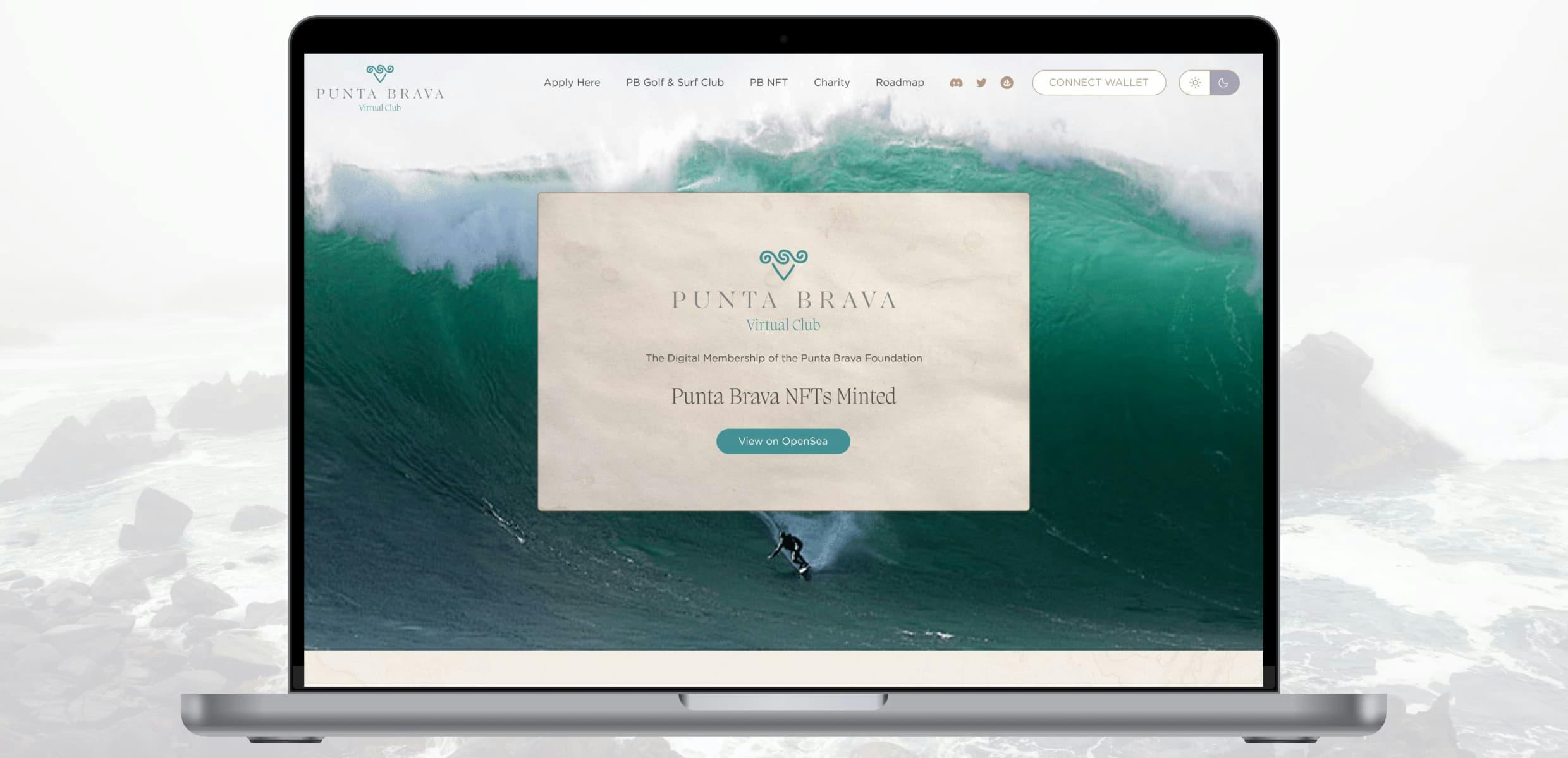
The webpage design below utilizes both PBVC brand and wireframe structure to showcase a page that is both professional and logical, with high quality content. The page is educational, honest, and inviting.
The hero and header navigation are the main “web3” elements of the page. Namely, a wallet connection button (to implement Rainbowkit), as a minting section for the 1,800 membership NFTs.
The rest of the page details membership and philanthropy opportunities, as well as giving a nod to the Apes who commissioned the project.
Tablet and Mobile design versions available upon request.

Web Design - Homepage (Dark Mode)
Not included in the original PBG&SC brand, dark mode was requested to pay homage to the Nave SEALs involved in the project.

Results & Impact
The three Apes who commissioned the project (Brass Grass, LT Trippy, and Highseas) loved the designed I created for them. The end product was a successful page that truly felt like an extension of the Punta Brava Golf & Surf Club, while tying in web3 and charity efforts for the local medical organization and Navy SEALs.
Sadly, I don’t think these designs were ever developed. Last I heard, the Apes were waiting for the NFT market to turn back around to create the site and launch the 1,800 PBVC NFTs.
Reflection
What Went Well
- Communication and two-way information processing with the client.
- The client’s vision. They knew exactly what they wanted, which made the design process extremely fluid.Information architecture and wire-framing.
What Was Challenging
- Ensuring the PBVC brand accurately extended the PBG&SC brand.
- Choosing dark mode styles that would compliment both brands.
What I Learned
- Tiger Woods and Kelly Slater have a Golf & Surf Club.
- How to create subtle backgrounds with imagery throughout a prestigious brand design.
- How to organize seemingly unrelated information into a cohesive message.
What I'd Do Differently
The designs provided above do not include the actual NFT artwork. If I did this project again, I may ask for the actual artwork before the UI UX design, then alter the website styles around it.