
Technologies
Figma
Typescript
TailwindCSS
Next.js
React.js
Adobe Photoshop
Adobe Illustrator
Telcoin Company Website Design and Development
Nov 2021 - Jan 2022
Project Type
Web Design
Frontend Engineering
Industry
DeFi
Finance
Blockchain
Position
Fulltime Employee
Link
About the Brand
Telcoin creates fast and affordable, decentralized end-consumer mobile products. Their main two products are a decentralized crypto exchange on the Polygon blockchain and fiat remittance service (bank account to mobile money eWallet).
About the Project
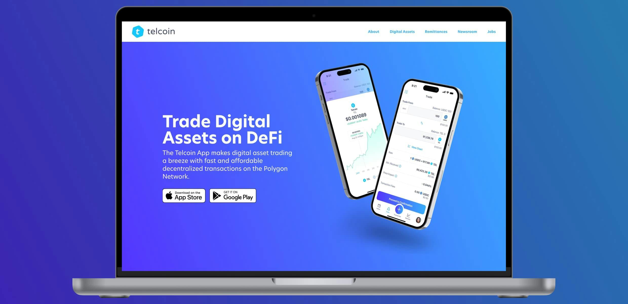
The Telcoin company website explains about the company and its products. It also has a a list of digital assets with current prices, a newsroom, company jobs postings, a support contact form, and a few campaign marketing pages.
Objective
To design and build a professional and approachable company website that:
- Gave an overview of the company, history, mission, and global offices.
- Explained the products that it offers.
- Had a newsroom - news articles and blog posts related to the brand.
- Had a job board for current company openings.
- Was an easily manageable central repository for all brand-related web pages (no click funnels, no one off marketing pages, etc).
- After initial release, added objectives:
- Remittances: Gave estimate quotes for sending money abroad using the product.
- Market View: Showed real-time digital asset prices for trade-able assets on the product.
Role
My role responsibilities included:
- Researcher
- Project Manager
- Information Architect
- UX UI Designer
- Lead Frontend Engineer
Challenges & Considerations
- Presenting company information to a global audience. Telcoin has offices in at least 10 countries with diverse cultures. Information needs to be simple and easy to understand.
- Ensuring a professional brand permeates through all page designs with polished, reusable components.
- Creating a structure where top level navigation items coexist logically.
- Providing a solid structure for whatever additional pages business needs will need in the future to meet business needs.
Strategy & Process
Site Structure
To begin, I determined the website structure. Most of the pages are informational, describing the company and relevant information regarding its products (remittances and digital asset trades).

Three components on the site are interactive, enabling the visitor to input information:
- The robust Support Form on the Support page.
- The Remittance Calculator on the home page and Remittances page.
- Digital Asset Charts on each Digital Asset page.
With a site structure and brand (created separately) determined, I proceeded to wireframe and design mockups for each page. Below are desktop versions of some of these pages.
Website Design - Home Page
The home page introduces the visitor to Telcoin. The purpose is to briefly explain what Telcoin is, the products it offers, and give an easy way to find out more information. It’s an overview of the entire website.
Structure:
- Hero
- Product - Telcoin App Trade
- Digital asset prices
- Product - Remittances (with Remittance calculator)
- TELx overview
- Newsroom
- CTA - Apply

Website Design - About Page
Rather than a single About page, it seemed appropriate to segment general information three categories. These became the three about pages: About Company, About The Telcoin App, About The Telcoin Platform.
Structure:
- Company overview
- Company mission
- Office locations
- Business hours
- Leadership team
- CTA - Apply

Website Design - Digital Assets
The Digital Assets page lists the assets available to trade on the Telcoin App. Visitors can easily see what assets are available for trade, and receive basic charting information for each.

Selecting a digital asset from the list brings you to its Digital Asset page, complete with a historical pricing chart and information on the asset.

Website Design - Remittances
Telcoin’s original flagship product was fiat remittances (sending money abroad) from USA and Canada to eWallets around the globe. The Remittances page’s purpose is to explain the product, show the benefits of Telcoin Remittances, and list the countries where the product is available.
The page has the following structure:
- Remittance calculator
- Competitor price comparison
- Remittances overview
- Available countries - Send & Receive list
- CTA - Download App

Website Design - Newsroom
The Newsroom’s purpose is to keep the visitor up to date on public information regarding Telcoin. It has the following structure:
- Newsroom overview
- Twitter feed
- Newsroom article list
- 3rd party referenced article list
- Social links
Telcoin historically released news articles through their [Medium Page](https://telcoin.medium.com/). These same articles can now be viewed in the Newsroom when an article is selected.

Website Design - Support Page
The support page became one of the most important pages on the website. Any time a customer faces a problem, they are directed to submit a ticket via this page. The simple interface is the entry point for the support team’s entire system.

Website Design - Marketing Page
Depending on the Commercial Team’s needs, one-off pages are sometimes requested for campaigns and conferences they attend. Below is an example when they attended MWC Barcelona 2023.

Results & Impact
The Telcoin website renewal was successful. The initial project took about two months of full-time work to complete, from initial wireframes to web development code completion. A robust, Next.js web application replaced a single static HTML company page, packed with useful information on the company, its products, and more.
Because we’ve migrated from a static HTML page to a robust web application with programmable CMS and predetermined component library, the web team can now design, build, and test on-brand webpages 10x faster than the previous setup.
Reflection
What Went Well
- Developing a brand and, by extension, reusable components that were approachable and professional.
- Font and color selection.
- A site structure that provided valuable information to anyone interested in the company.
- Gathering company information to create logical pages, then receiving approval to publish.
What Was Challenging
- Organizing the company’s information.
- Determining an easy-to-update CMS to host content.
- Creating a robust support form to aid the support team.
- We initially used an icon package that the publisher decided to remove from public npm repository without notice, so I had to redesign and install a new icon library before we could push any more updates to the site.
What I Learned
- The difference between gimmicky stock images that most designers use for company websites, and those that actually work to create a professional on-brand image.
- Design and code in the following order for best results: mobile → tablet → desktop.
- How to work with several APIs, like CoinGecko, Zendesk, Greenhouse, etc.
- How the legal process works in regards to publishing content on a corporate website.
- When you build on others’ code (open source npm packages) remember that they can be discontinued without notice, and plan accordingly.
What I'd Do Differently
- We began the project with Contentful as a CMS, which was a terrible decision. We since migrated from it, but if I would have known what I know now, I would have never used Contentful.
- There are several value-adding sections that I’d like to add to the public website. Perhaps I should have pushed for some of them harder during the planning phase.